Initial concepts
So, what we can do with the Platform?
Register and login
First Steps - Creating your project
Profile
Permission System
Project Dashboard
Platform Glossary
Changing the Platform Language
2-Factor Authentication
Invalid authentication code
Artificial Intelligence
Human Attendance
Weni Chats: Introduction to the Chats module
Weni Chats: Human Service Dashboard
Weni Chats: Attendance distribution rule
Weni Chats: Using active triggering of flows
Using groups to organize human attendance
Studio
Contacts and Messages
Groups
Messages
Triggers and Campaigns
Adding a trigger
Triggers Types
Tell a flow to ignore triggers and keywords
Campaign introduction
How to create a Campaign
Editing events
Creating contact from an external Webhook
Contact history
How to Download and Extract Archived Data
Integrations
Settings
How to connect and talk to the bot through the settings
Adding a Facebook Channel
Adding a Viber channel
How to Create an SMS Channel - For Developers (RapidPro)
Web Chat Channel
General API concepts and Integrations
How to create a channel on twitter
How to create a channel on Instagram
How to create an SMS channel
Adding ticket creation fields in Zendesk
Adding Discord as a channel
Creating a Slack Channel
Adding a Viber channel (RapidPro)
Creating a Microsoft Teams channel
Weni Integrations
How to Use the Applications Module
How to Create a Web Channel
Adding a Telegram channel
How to create a channel with WhatsApp Demo
Whatsapp: Weni Express Integration
Whatsapp: How to create Template Messages
WhatsApp Template Messages: Impediments and Configurations
Supported Media Sending - WhatsApp Cloud
Zendesk - Human Support
Ticketer: Ticketer on Rapid Pro
Whatsapp Business API
Active message dispatch on WhatsApp
Whatsapp business API pricing
How to Verify My Business
Whatsapp Bussiness API: WhatsApp message triggering limitation
Regaining Access to Business Manager
Webhook Configuration: Message Delivery Status
The Basics of Integrations
Native ChatGPT Integration
Native Integration - VTEX
General settings
General Project Settings
Weni Chats: Setting Up Human Attendance
Weni Chats: Human Service Management
Flows
Expressions and Variables Introduction
Variables Glossary
Expressions Glossary
Flows Creation
Flows introduction
Flow editor and tools
Action cards
Zero Shot Learning
Decision cards
Adding Media to the message
Call Webhook: Making requests to external services
Import and export flows
Using expressions to capture the user's location
Viewing reports on the platform
Route markers
WhatsApp Message Card
UX Writing
Concepts
Good Practices for Chatbots Based on UX Writing
Hierarchy of information
Usability Heuristics for Chatbots
UX Text Standards
Weni CLI
- All Categories
- UX Writing
- Hierarchy of information
Hierarchy of information
Updated
by Manu da Silva
Hierarchy of Information
As we have seen, empathy is an essential principle for UX Writing. The user should be at the center of the process, and the content must be accessible and understandable to the target audience.
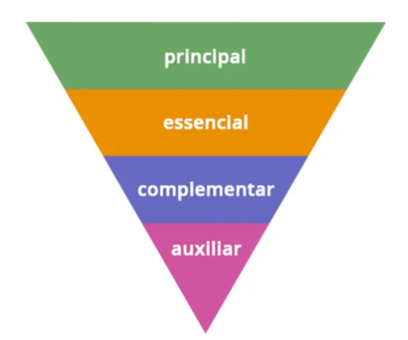
To achieve this, the information architecture is structured to classify content into levels: primary, essential, complementary, and auxiliary, as illustrated in the image below.

This categorization aims to make the writing clearer and reduce cognitive load during reading. Before finalizing a text, the writer should ask: can the user accomplish what they need with a quick read?
To ensure clarity, the following points should be observed:
- Use simple words (exploring synonyms when necessary);
- Prefer the use of verbs to prompt action, focusing on what needs to be done;
- Avoid interspersed phrases, as they make comprehension difficult, especially for those who struggle with long texts;
- Avoid jargon and technical terms;
- Use humor sparingly;
- Show only what is essential: consider adding a step to the user journey if it helps to highlight what’s truly important, rather than overloading with information the user has to filter;
- Keep the bot consistent in language and tone.
